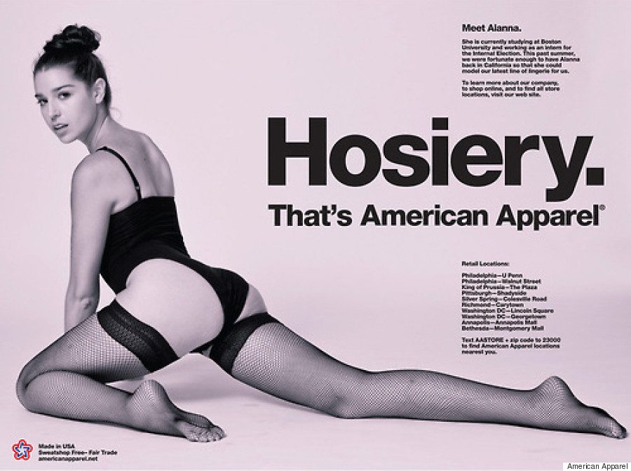
Main features of the typeface is the termination of all strokes on exact horizontal or vertical lines. The letter spacing is also tight in comparison to other typefaces, this gives it a dense and compact appearance.
The typeface is widely used in branding as it doesn't have any strong characteristics and is known for being neutral therefore can be manipulated to portray the message of a company. Designers such as Neville Brody, Stefan Sagmeister and David Carson all talk about the use of helvetica in their work.


No comments:
Post a Comment